Architecture
Thoughtful spaces, rooted in their surroundings.
An editorial website for an architecture and interiors practice. Considered typography, generous space, and a clear path into the work.
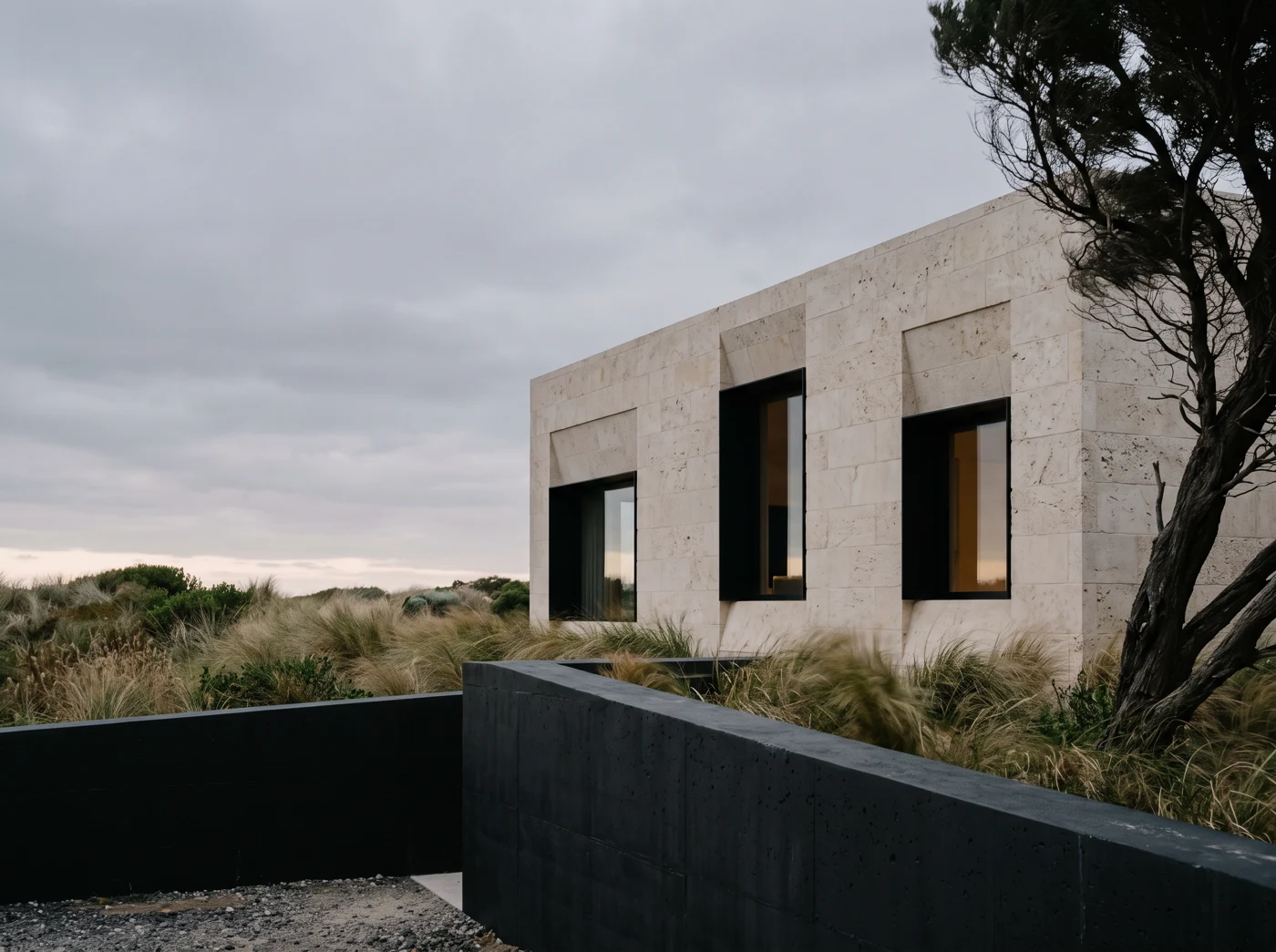
Still House designs homes with a quiet presence: natural light, honest materials, nothing added for show. Their website needed to feel the same way.
Practices like theirs often bury the work beneath menus, sliders and long service lists. The brief was to let the architecture speak first and make it easy for the right client to get in touch.
Spaces that give more,
by asking for less.
We treated the site like a printed monograph. A large, calm serif carries the headlines, set against a restrained palette of stone, paper and charcoal.
Navigation was reduced to three decisions: see the work, understand the approach, start a conversation. Projects read as short essays on light, material and place rather than as galleries.
Photography is given room to breathe, with consistent crops and pacing so every page feels like part of one considered whole.
A quieter, more confident website that reflects how the practice works, and gives prospective clients a clear, unhurried route from first impression to first conversation.